By Your Hands
Artistic Curiosity Survey Results (By Your Hands)
Hello everybody! Today I'm going to be talking about the results of the Artistic Curiosity survey I conducted about a month ago. Originally I wasn't thinking about making a response to the results since I've been burned out from writing so many survey responses. However, I felt the need to make a response to this one because it is important to the game's future and I should address some things related to it. Plus, the only other survey I haven't made a response to is the general Act 0 survey which didn't even get 50 responses, so I don't think I'd get much useful information from that. Note that I'll be tackling this a little differently from my previous responses. I'll talk about the results in far more general terms since you can always view them yourself, but I will touch on them. You can view them here. I just want to focus on how I'll be dealing with these aspects. Without further ado, let's get right into it.
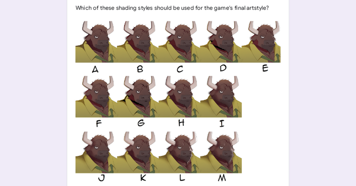
The first question gives you 13 different art styles and tells you to pick five or fewer that you like. Most responses picked three or fewer choices for this question. I say "art style" but the more proper term would be "rendering style" as they all use the same lineart and flat colors. L was the most popular, alongside styles that were similar to it, but G was a minor dark horse, which I found fascinating. I'd say that G's style was similar to Burrow's art style while L's would be more in line with certain furry artists like Alpha0 (who I commissioned to make art of Kamil). I ended up choosing L since that was the most popular but I will say that it was a rendering style I wasn't used to, since All in Love and War and By Your Hands had cel shading more similar to D's. I think the updated sprites look great though and I'm learning a lot. That said, I'm taking note of the critique of L looking too soft, so I made sure to put in some harder edges there.
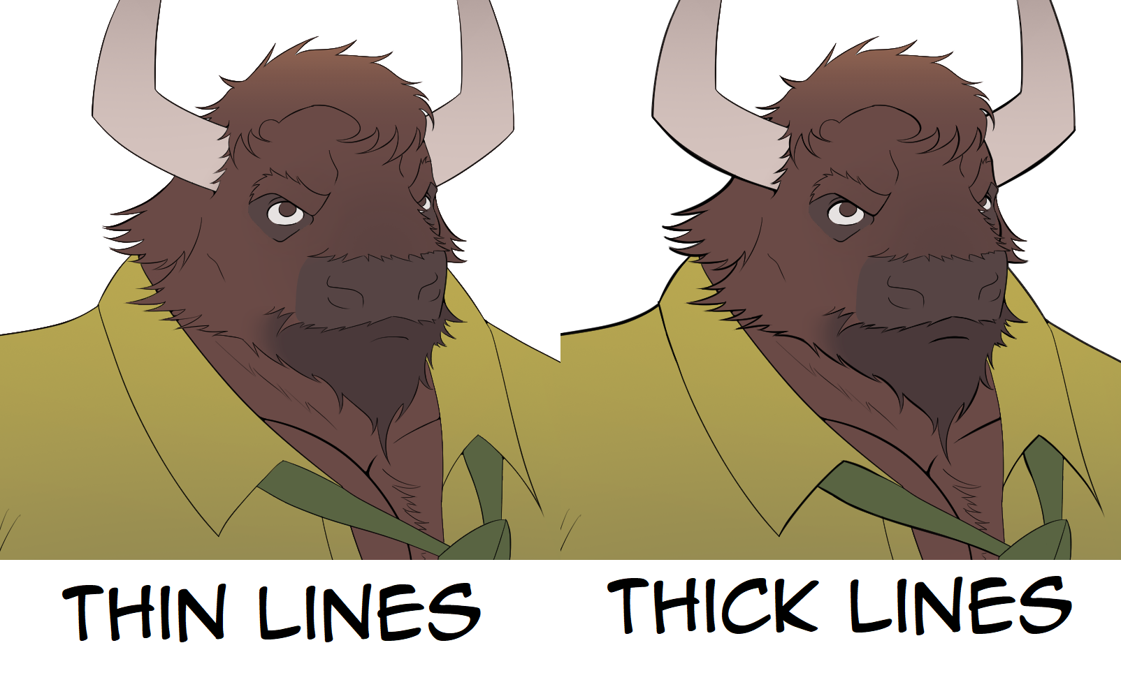
The next question asks whether I should use thin or thick lines and most people preferred thick lines. I do agree that the thick lines look better but I kinda did a boo-boo and forgot to give most of the updated sprites thicker lines. Thicker lines are more fun to draw, but thin lines are harder to screw up and take less time to draw. The newer sprites, such as the police officer, do have thick lines all around, so I am keeping this in mind. I will also give thicker lines to the updated sprites, once I remember to do that.

Next up are the close-ups. Most people I should put them in the game. I also did a bad here because, with the way I showed the example, I made it seem like I'd put this all throughout the game. That was not the intention. I only put in this question because I wanted to know if it was okay to put such close-ups here and there. Hopefully, you guys weren't too mislead. I should note something about close-ups. In terms of visual hierarchy, they are perceived to be more important than a similar expression change, but less important than if there was a unique sprite or CG for the scene. This allows for the game to still have visual stimulus even during parts that have a lot of narration and don't necessitate the need for CGs. So yeah, I haven't added any closeups yet, but I will do so in the near future. Just don't expect them to be everywhere.
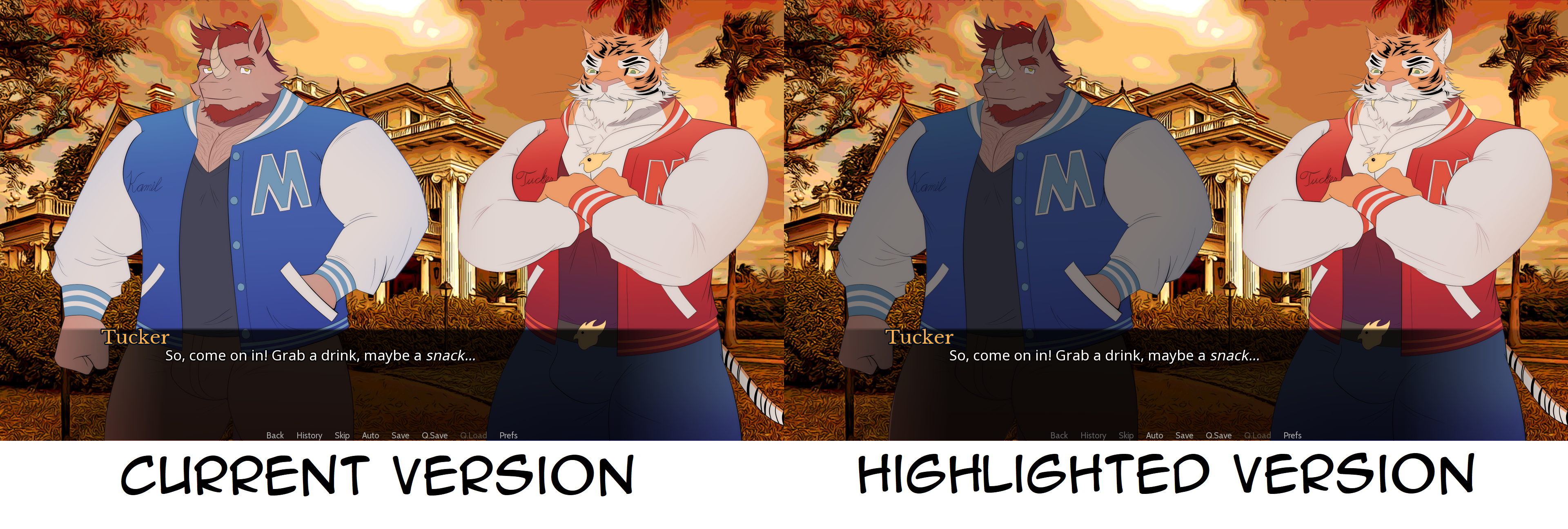
Next is the auto-highlight feature, which most people were in favor of. This wasn't something I was all too thrilled about, I only added the question because people suggested it. I can usually tell which character is talking at a given time and something about the auto-highlight feature distracts me. I haven't added it yet because it involves me coding a bunch of stuff that I'd rather use the time and energy for other stuff. When I do add this feature, I'll definitely make it an option if I can.
For character designs, surprise surprise, Kamil and Brendan ended up being the most liked character designs while Owen and Vlad ended up having the least favorable responses. Ironically, Kamil ended up getting the most changes when I updated the sprites, but that was mostly because his original sprite didn't really look like a rhino/karkadann and it was bugging me. I also think Kamil's new head fits his character arc better. Rex has the most average response out of them all, which is only fair considering you only see him in three CGs (as of 0.2.0), two of which are only seen in one route. I got a few enlightening free responses and I'll definitely be taking some of them in mind, but I won't be taking them all to heart. Most notably, people were complaining that Vlad looks too ugly and it was weird. On one hand, I don't want to have a bad character design in the game, on the other hand, the point of Vlad's character is that he doesn't care what other people think of him. I've gotten a bunch of people telling me they like Vlad's new sprites a lot more, so I'm glad it worked out more or less. And no, I'm not going to make Owen less fat.
All I have to say about clothing is that uniform is supposed to refer to an outfit that's associated with the character's work. So Connor's uniform would be the McCree's outfit he wears at work while Kamil's uniform would be his football clothes. Other than that, most people want to see casual clothes, except for Brendan, who people want to see in business casual clothes which are already what he's wearing but okay then.
Finally is the GUI I asked these questions because I'm terrible with GUI and I needed an idea of how to make the game's GUI look good. Since it's not an exciting topic, all I'll say is that I got some decent responses and I have a general idea of how the game's GUI should look (but not exact). As for the last question, I do like most of the responses I got there.
And that's everything. I hope this all explains the art direction the VN's going with and what's going on with stuff like the closeups and auto-highlight. I hope you guys enjoyed this post and I'll see you later. Have a good day!
Comments
Log in with itch.io to leave a comment.
Owen's design seems fine, and is one of the cutest characters. My favorite characters in the VN so far are Owen and Vlad.
Usually a character can be visually appealing even if fat so long as weird proportions are avoided such as when people give a character thighs and hips that are massive compared to the upper body (e.g., when the thigh and hip width starts to extend beyond the shoulder width which is a shape profile often linked with lipodemia in mammals). Thankfully many artist that do that kind of hyper art, tend to limit it to female characters while not ruining the male characters with it.
Owen design, I like it a lot but if anything make him thicker. Cant fully tell through his hoodie much, have their thighs and moobs (chest) be a bit more pronounced I'd say 🤔
Drawing Owen was a little hard because I wanted to draw him overweight without him being muscular. I didn't want his chest to look like pecs. Maybe I'll make his chest and thighs more noticeable.
Owen's design is good, though making him thicker seems like it would further reduce his cuteness level.
The hell, people want Owen less fat? Don't they know fat people have so much to love?
Thankfully only one respondent said it but I've seen other people elsewhere say that as well. Best to just ignore those people.
+1 Truth, i think short stocky men are attractive too, Owen is exactly that 🌟